So I probably don't need to tell you this since you already know, but
Arizona sucks!
It turns out that even documented immigrants agree, and I have the graphs to prove it!
You see, it all started when I took a great Visualization course this past term which was taught by Maneesh Agrawala. Maneesh gave enough structure for the assignments, but also left some aspect of each open ended. For example, our first assignment had a fixed dataset which everyone had to make a static visualization of, but the means by which we did that was entirely up to us. A lot of people used Excel (in graduate level CS class? gross!), some people wrote little programs (I wrote mine in python using matplotlib and numpy, and did some cool stuff that I will have to post about another time and contribute back to matplotlib), there was even a poor sap who did it all in Photoshop, as I recall, but anything was fair game. Turns out we could even just draw or make something by hand and turn it in!
The second assignment, the source of my graphs which quantitatively demonstrate the suckiness of Arizona, required us to use interactive visualization software to iteratively develop a visualization by first asking a question, then making a visualization to address this question, and going back several times refine the question and make successive visualizations.
On thing to keep in mind is that, overall, naturalized citizens are both an exclusive and a discerning lot. In most cases, you have to be a permanent resident (have a Green card) for 5 years before you can apply. And there are quotas for how many people can get a Green card every year, so there are lots of hoops to jump through. Given the amount of effort involved, wouldn't it be nice to look at a breakdown of naturalized citizens by state? Because that would give us an idea about which states immigrants percieve as, for lack of a better word, "awesome", or if you're not so generous, "least sucky". I bet you'll feel that this second description is more appropriate once you take a look at the data, but keep my "least sucky" premise in mind as you read my original write-up which focused on a different angle (but from which we can still draw some reasonable conclusions). I'll return to make a few more comments about the title of this post after the copy-pasted portion.
here's my original write-up:
begin cut --->
There are three kinds of lies: lies, damned lies, and statistics.
As an immigrant, I've always had the subjective feeling that about half of the people I'm acquainted with are either themselves immigrants, or the children of immigrants. The US prides itself in being a melting pot, a country built by immigrants, so I wanted to dive into the data that would help me understand just how large of a role immigration plays in terms of the entire country. The question I started with, for the purpose of this assignment is this:
What's the relationship between naturalizations and births in the US?
But what I really wanted was to find out was what kind of question do I need to ask to get the answer that would be consistent with my world view. :)
To do this, I started with the DHS 2008 Yearbook of Immigration Statistics, which was linked from the class website.
The file I started with was natzsuptable1d.xls, which required cleanup before I could read it into Tableau. Turns out that even though "importing" to tableau format is supposed to speed things up, it seems very fragile and would regularly fail when I tried converting type to Number (there were some non-numeric codes, like 'D' for 'Data withheld to limit disclosure). *NOT* importing to Tableua's desired format also had the added benefit of allowing me to change the .xls files externally, and having all the adjustments made in Tableau, without having to re-import the data source.
Frustratingly, the last column and last row kept not getting loaded in Tableau! I also ran into an issue which I think had to do with the 'Unknown' country of origin and 'Unknown' state of naturalization which made the totals funky. It took a while to figure out, but there was a problem with Korea, because there was a superscript 1 by it, indicating that data from North and South Korea were combined.
I was trying to use the freshest data possible, so I used the CDC's National Vital Statistics System report titled Births: Preliminary Data for 2007. I just had to copy paste the desired data, and massage it to fit the proper order columns in the excel table I already had handy. I put zeros for U.S. Armed Services Posts and similar territories which is probably not accurate, but this data was not available in the reports that I found. Interesting factoid: according to NVSS (CDC), in 2007 there were more people born in NYC than the rest of the state combined. (about 129K vs 126.5K). The only caveat with this data is that it contains only 98.7% of the data. The states with some missing portion of their data tabulated are Michigan (at 80.2% completeness), Georgia (86.4%), Louisiana (91.4%), Texas (99.4%), Alaska (99.7%), Nevada (99.7%), Delaware (99.9%). Thus, state-level analysis for MI, GA, and LA may be distorted.
The data I had from DHS is for Fiscal Year 2008, which, as it turns out, goes from October 1st, 2007 - Sept 30th, 2008. Thus, no matter which combination of NVSS and DHS datasets I used, there would necessarily be a mismatch in the date range covered by each, so I settled with describing my visualization as "using the latest available data", noting the actual dates for each dataset in the captions. Also, the NVSS report contained a graph of births over time, which fluctuates very modestly from year-to-year, thus the visualization would not change qualitatively if I had 2008 birth data on hand.
I was having a really hard time trying to get a look at the data I wanted to see in one sheet, and ended up trying to make a dashboard that combined several sheets. I couldn't figure out a good way to link the different states across datasets. I struggled for quite a while to pull out the data that I wanted to look at, and ended up having to copy past everything from DHS and NVSS (transposed) onto a new sheet in Gnumeric.
Here's the result:
[caption id="" align="alignnone" width="744" caption="Initial visualization"]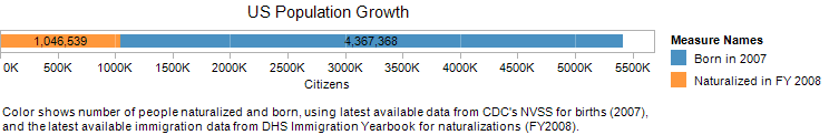 [/caption]
So, in all of the US, about 1 in 5 new american citizens is an immigrant, or for every four births, we have one naturalization. That was kind of unsatisfying. I've lived in California the entire time I've been in the US, and I feel that at least California is more diverse than that. There's all those states in the middle of the country that few people from the rest of the world would want to immigrate to, yet the people living in them are still having babies, throwing off the numbers which would otherwise support my subjective world view...
So I decided to look at the breakdown by state.
Broken down by state, what's the relationship between naturalizations and births in the US?
[caption id="" align="alignnone" width="1226" caption="my second iteration"]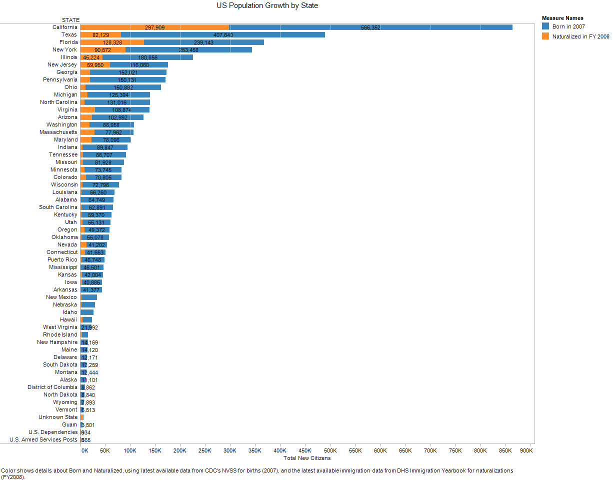 [/caption]
I added the reference lines so that you could both read off the approximate total easier, and be able to do proportion calculations visually, instead of mentally. This started looking promising, as I've only lived in California, and it looks like it's got quite a lot of immigrants as a portion of total new citizens.
It was still kind of hard to see the totals, so I decide to create my very first calculated field - which would had the very simple formula [Births in 2007]+[Total Naturalized]. Using this new field, I could now make a map, to see the growth broken down geographically. This was just a way of reaffirming my earlier bias against the middle states having babies without attracting a sufficient number of immigrants to conform to my world view.
[caption id="" align="alignnone" width="1072" caption="gratuitous map (was too easy to do using the software)"]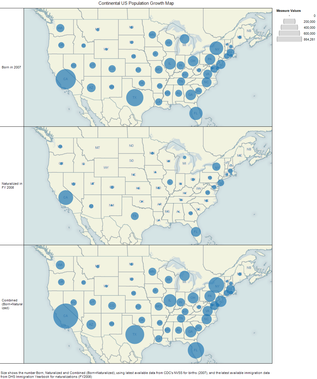 [/caption]
In the breakdown by state bar graph, it was also difficult to visually compare the total births by state, because they all started at a different place, depending on the number of naturalizations for that state. So I decided to split the single bar and make small multiples for each state.
[caption id="" align="alignnone" width="1278" caption="back to something more interpretable"]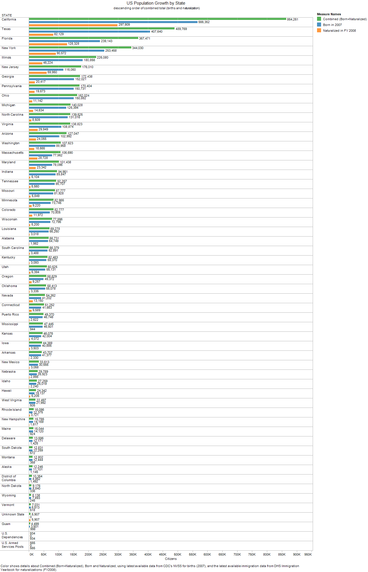 [/caption]
It's interesting that the contribution of naturalizations slightly changes the ordering of the growth of states. For example, Florida has fewer births than New York, yet it's total growth is larger, because it naturalized 30,000 more people than New York. With this small multiples arrangement, it was now possible to do positional comparisons across categories, not just between naturalizations and totals. Turns out that more people get naturalized in California than are born in the entire state of New York. And since New York has the third highest number of births annually, more people got naturalized in California than are born in any state other than CA and TX.
This was too large of a graph, and the story I'm interested in is really the ratio between the birth and naturalizations (the closer to 1:1, the better), so I made another calculated field, which is exactly such a ratio, multiplied by a factor of a thousand, so I could give it a sensible description (Naturalizations per 1000 births). This refines my question
For every 1000 people born in the US, how many many immigrants become naturalized?
I then ordered on these ratios, and decided to filter the top states. Guam would have made the cut, but it is not a state, and (though I didn't mention it earlier) it's NVSS birth data was only 77% complete, so I excluded it. Fifteen is a nice odd number, but it actually marked a nice transition, as after Texas, everything else is less than 200 naturalizations per 1,000 births.
The small multiples bar graphs still looked too busy, and there was redundancy in the data, which didn't tell a succinct story. So I switched to just look at the ratios alone. This revealed, that, indeed, the fact that I've been living in California makes my perspective quite unique, as it is one of three states, along with Florida and New Jersey, to have an outstandingly large number of naturalizations compared to births. It is so high, indeed, that it puts the naturalization per births rate in these three states at more than twice the national average!
Looking at ratio alone tells us about the diversity in each states growth, but carries more meaning in the context of total growth . Thus, added the combined totals (naturalizations and births) as a size variable, for context. The alternating bands to both make it easier to read off the rows, and to aid the comparison of sizes by framing every data point in a common reference window. It obviates that California is the state with 864,261 new citizens because fills the frame completely.
Final question: What are the Top 15 "Melting Pot" States?
[caption id="" align="alignnone" width="1095" caption="almost done, would be nice to include context from the visualization I started with"]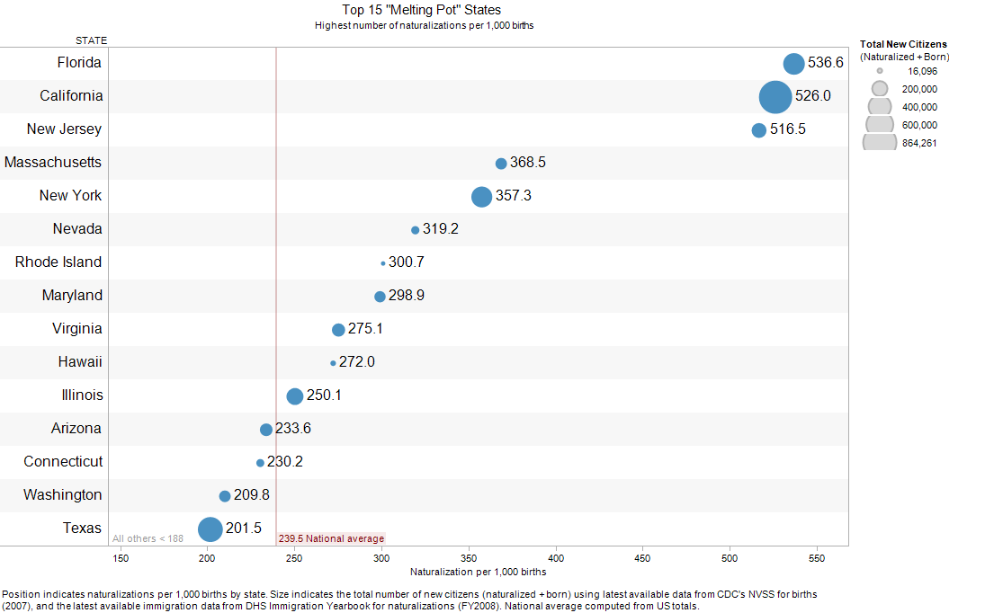 [/caption]
Ordering the data in this way also shed light on the small but still very diverse states that would not have otherwise made the cut (and did not pop out in any manner on my previous bar graphs). Rhode Island and Hawaii got it going on, in terms of attracting immigrants.
Certainly the fact that I'm an immigrant myself also greatly influences whom I associate with, further skewing my world view towards a 1:1 ratio, but I'm actually quite impressed with just how close to that ratio is in California - 1:1.9. Of course, the data I've analyzed does not include the American-born 1st generation of children, nor does it take into account the number of immigrants living in the US that do not have citizenship. All of these factors would surely push the ratio even closer toward 1:1.
I decided to combine the US total growth information, since it's gives further perspective on the entire data set, such as the fact that California accounts for about 16% of total US growth. It also sheds light on how the US average was calculated. A new "twice the nat'l avg" line makes explicit the three most diverse outlier states mentioned before. I also changed the colors to match the convention used in the bar charts made earlier. The US combined total line semantically links the data plotted with the national growth bar chart - i.e. the green dots are formed by the sum of born and naturalized citizens.
[caption id="" align="aligncenter" width="1259" caption="What are the Top 15 "Melting Pot" States?"]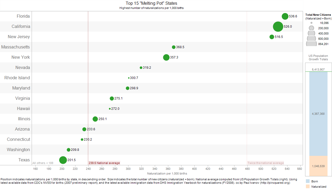 [/caption]
<---- end of cut
Ok, so, to be honest, it turns out that I wrote a large chunk of this post (Arizona suckage included) before I actually looked back at my visualizations, only going off my memory that it wasn't in the top 10. So Arizona is just below the national average in this "Melting Pot" ratio (a measure I made up, the number of naturalization per 1000 births). Since it is #12, some might say, "Paul, Arizona's on your top 15 list", to which I'll reply: "So's Texas."
I guess I just wanted to share these purdy graphs I made a few months back, and it seemed like there was a somewhat topical angle on them a few weeks back, when I remembered that I hadn't posted them on here yet. Anyway, I'd love to hear back your thoughts.