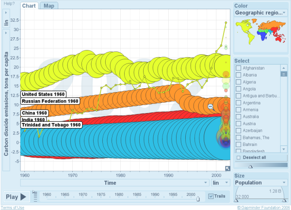
Graph: **CO2 emissions per capita versus Time **
 Above: a plot I made using Gapminder. When I first tried this tool a few months ago, I was left confused and unimpressed. Luckily, since then, I've stumbled upon the following two explanatory videos (~20 min each).
After watching the videos, you can play with Gapminder yourself as it is a web-based tool.
More info and tool links at gapminder.org.